
Documenting a Disney World trip doesn’t have to be cheesy; no pun to the mouse himself but, it doesn’t. The items that are traditionally offered to us are red, yellow, black, and white. Can we create magic with for all four parks using only those colors? Why this color scheme? Because they are taken from Mickey and Minnie Mouse’s attire, and has somehow become the unofficial color scheme of all things Disney in the paper crafting world. Can you imagine going to Animal Kingdom and having only that traditional color scheme to use to document all of your amazing pictures with? It would definatley be discouraging to say the least.
I have only been to Disney World twice with children, the other dozen or so times have been adult only trips. I still want to document my trip to the parks, without having to use the child like illustrations that are often made for us to use to memory keep our trips.
Working with a color scheme that compliments the pictures you are documenting will make for a more life like journal. It will make your pictures stand out more, and will tell the story best.

For this Animal Kingdom page I did in my travelers journal, I used colors that complimented the park as a whole. Natural colors are used throughout the parks design. The buildings blend into the background as the animals and foliage are the main stars. Browns, all shades of green, terra cotta, and stone are a great combo to the blue sky. I pulled from that color palette for this layout.
As it stands in the park, I too wanted the Tree of Life to be the focal point and stand out. I could have stamped the tree stamp in a bold color or black ink, but I wanted a more subtle look to compliment the picture not over shadow it. I stamped it in a watermark ink to achieve this look.
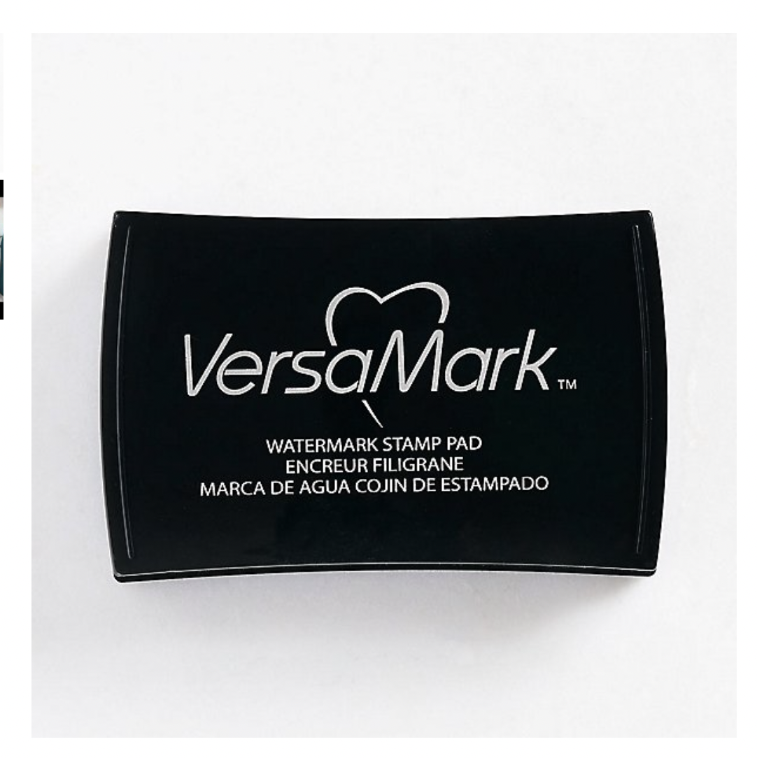
The VersaMark watermark ink will allow whatever you are stamping to be one shade darker than the paper color you are stamping it on. In essence this one pad can actually be 100’s of different colors all in itself! In the above example I stamped the tree stamp with it and then onto our stone colored paper, it in turn made the stamped image one shade darker then the paper resulting in a darker stone color almost grey color tree. I used it to make a background pattern for the layout.
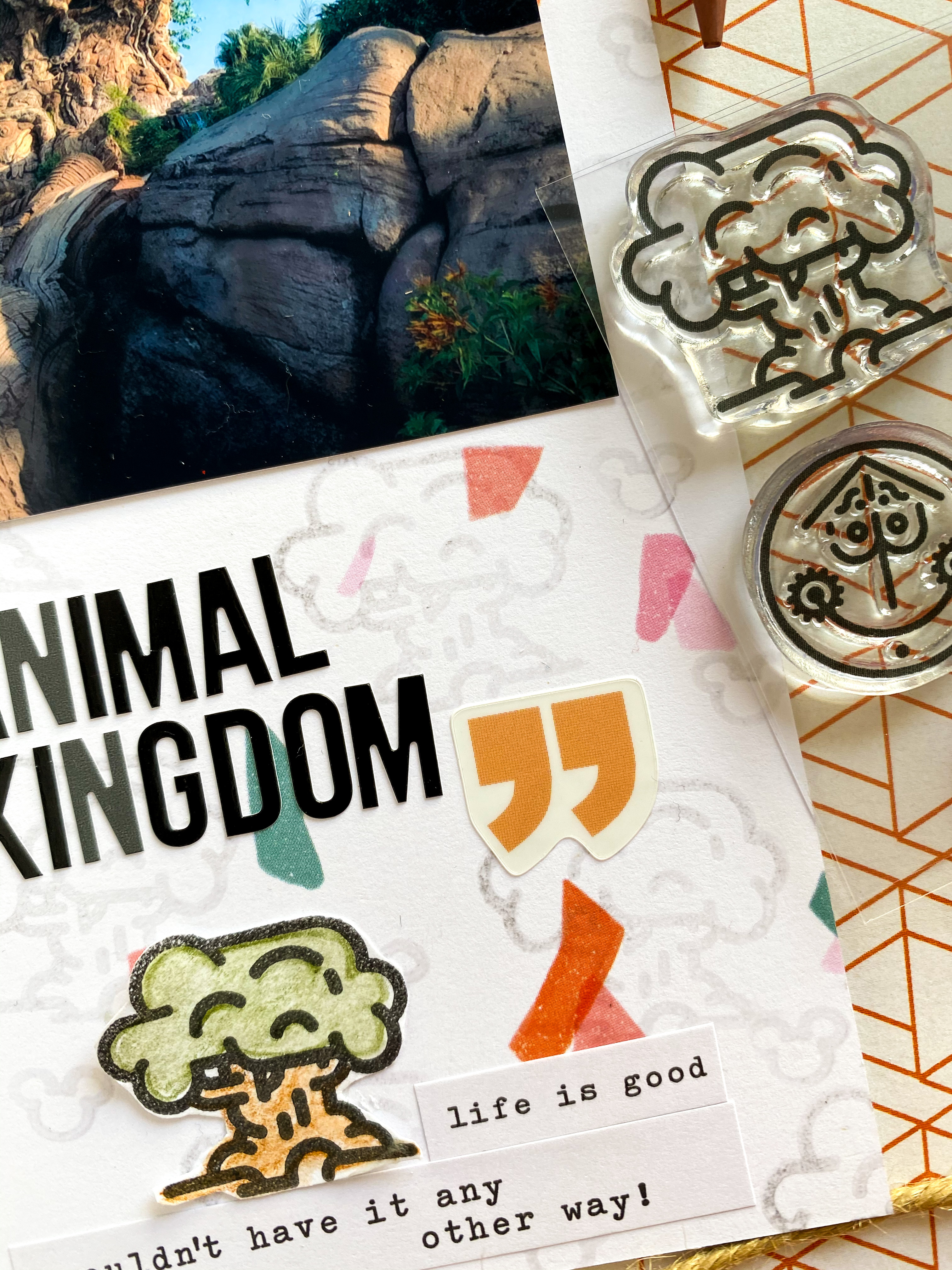
I wanted to draw your eye to the bottom of the page where I stamped a tree in black ink and colored it in with watercolored pencils. I could have used markers but I wanted a more natural look, a more subtle color scheme. Watercolor pencils are perfect to achieve this look. I outlined the tree, and then used my water brush to move the color throughout the tree, resulting in a very life like depiction of the tree. Markers in my opinion would have been almost too perfect and would have been a little too bold for my liking. The colored pencils are less forgiving allowing for imperfections to stand out. Just like in nature one tree can look like a million different shades of green depending on the angle you are looking at it from. I used the watercolor pencils from Fun Stampers Journey. The water color brush pen is a refillable pen with a brush like tip, allowing you to move the color from the pencils around your image. I used stamps from our line at Social Paper Plan.


Disney’s Hollywood Studios is a whole different color palette. You have more colors brought in to the making of that park. You have the eye-catching storefront buildings used to mimic California, you have the bright colors of Toy Story Land, and the futuristic colors from Galaxy’s Edge all in one park. Even the food is brighter here!
It is envetiable that Florida is going to be hot when you go.. that’s one of the best things about Florida! Cold drinks, foods, and desserts are to be celebrated there! I am going to show you two layouts that are most contrasting in design but are taken mere inches from one another.

In the above layout bright colors are welcomed in hopes you feel the excitement of a nice cold drink on a warm spring day! Even though the infamous Hollywood Tower of Terror is in the picture, it is merely a costar to the actual star of the picture.. the spiked frozen drink! That drink is the main attraction of this layout, that is what I wanted you to remember from this design. When framing this picture I could have gotten extremely close up and focused on the drink.. but I wanted to set the Tower of Terror in the background so we look at this layout we can picture ourself right back in that same spot sipping on a cold drink in Hollywood Studios.
Instead of using red as a supporting color I chose to use yellow as a highlight to the main star of the picture… the cold drink! I used the VersaMark watermark ink stamp to stamp a background pattern on the blue paper. Same ink different paper, and look at the difference. It made a dark blue image. I stamped the frozen ice cream image in yellow ink and colored it in with a yellow waterbed marker because I wanted a bold look. Used a Tombow water based brush pen similar to the one pictured below. They do have a blender pen available to soften the colors and blend almost pencil or paint like. You can purchase these pens individually or in sets.

This picture of the Hollywood Tower of Terror was taken maybe a foot to the left from the above picture! I took a Twilight-esque approach to this layout since the whole concept of this ride is developed from the Twilight Zone series. If you are older like I am, Twilight Zone was watched regularly at home.. can you recall the opening sequence when items are almost floating around in blackness? Same concept as these hotel and Mickey silhouettes are floating around on the paper. I stamped these images in a black ink and used the Tombow markers to color them in. I used two shades and the blender pen to mimic the outside of the hotel. Stamp set form Social Paper Plan


Now if we were at Disney World, Galaxy’s Edge would be at Hollywood Studios, but this particular picture was taken at the Disneyland Galaxy’s Edge. The futuristic colors of metal, carved stone and steel are used throughout this land. No bright colors at all, no balloons, no Disney logos on the cups, or food, or anything to remind you that you are at a Disney theme park. You are literally transformed when you enter this land to Batu! For this layout, you guessed it… I used the VersaMark watermark ink pad! I stamped it on this sage green paper and it gave me the most perfect shade of darker green to work with. For the stamped images I colored them in and fussy cut them out. I used the same watercolored pencils as in the Animal Kingdom layout except I did not use the water to activate the colors, I left them as is.

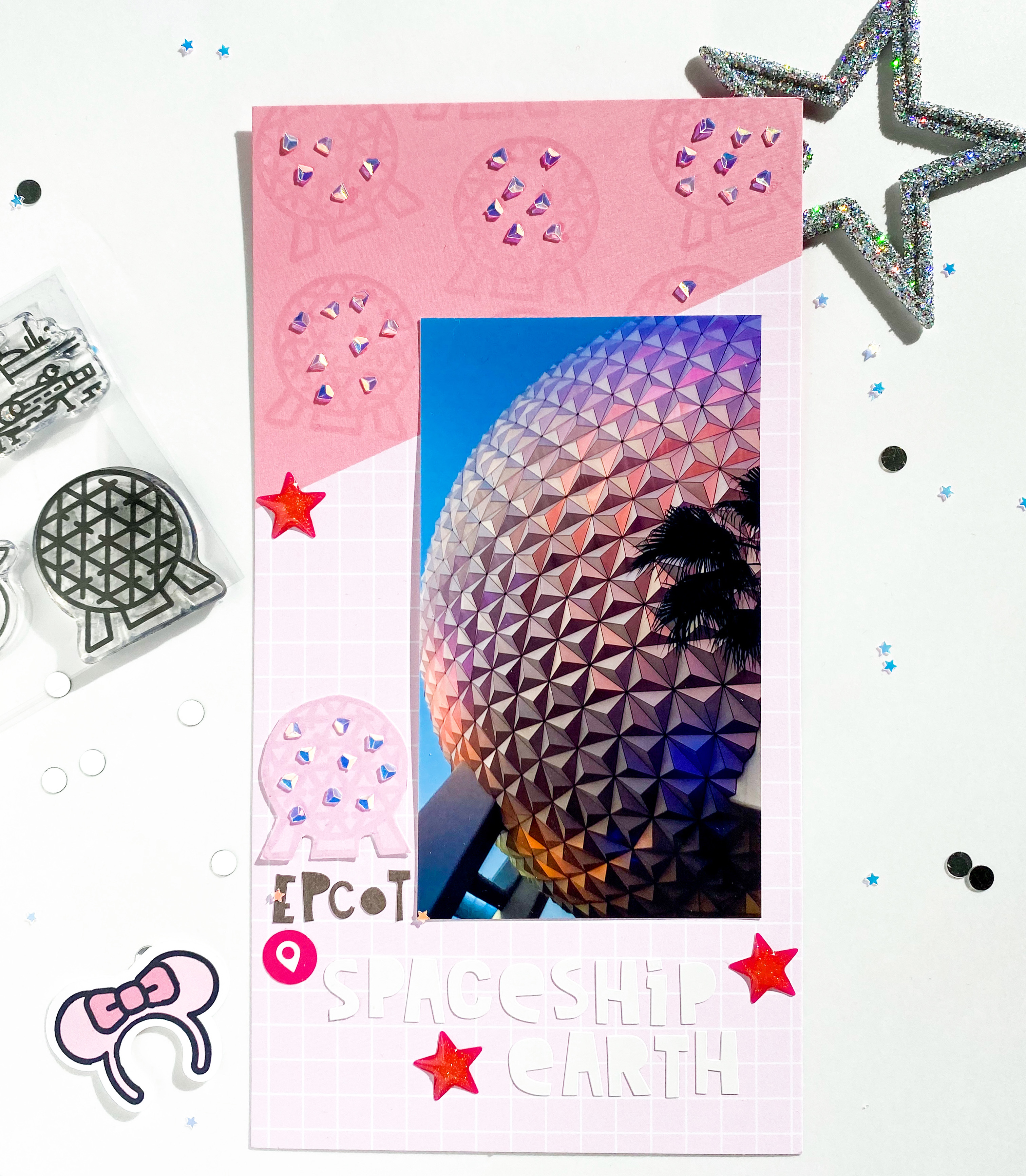
If you have ever been to Epcot you know the big golf ball in front know as Spaceship Earth is the icon of the whole park! It is the first thing you see when you enter, and the last thing you see when you exit the park. The big golf ball on any given day can look blue, grey, purple, pink, depending on what time of day it is and what kind of sunset Florida gives you. On this evening I was fortunate enough to get a beautiful pink sunset! I used that wonderful VersaMark watercolor ink pad on this layout to stamp the round sphere on pink paper and it gave me a darker pink to work with. I could not resist adding a few iridescent embellishment to compliment the perfect beams of light shining on Spaceship Earth.
I hope this helps you create out of the box layouts when documenting your Disney trips. That one ink pad yielded how many different colors for me? Yep! It is a must have in your craft arsenal. Now do not get me wrong, I do use those traditional Disney colors when I need too! For more ideas please follow along on Instagram @socialpaperplan. I have tagged all of the products I used in hopes it helps you find everything easier.
Have fun documenting your travels.
Tina
